Remember the movie Christmas Vacation? That over-the-top, chaotic approach isn’t just fiction anymore. Millions of American homes embrace that same aesthetic yearly, sometimes without realizing it.
Designers say there’s a difference between festive joy and visual overload. The issue isn’t what you decorate with—it’s how much and how you combine it all together.
What Designers Are Actually Saying
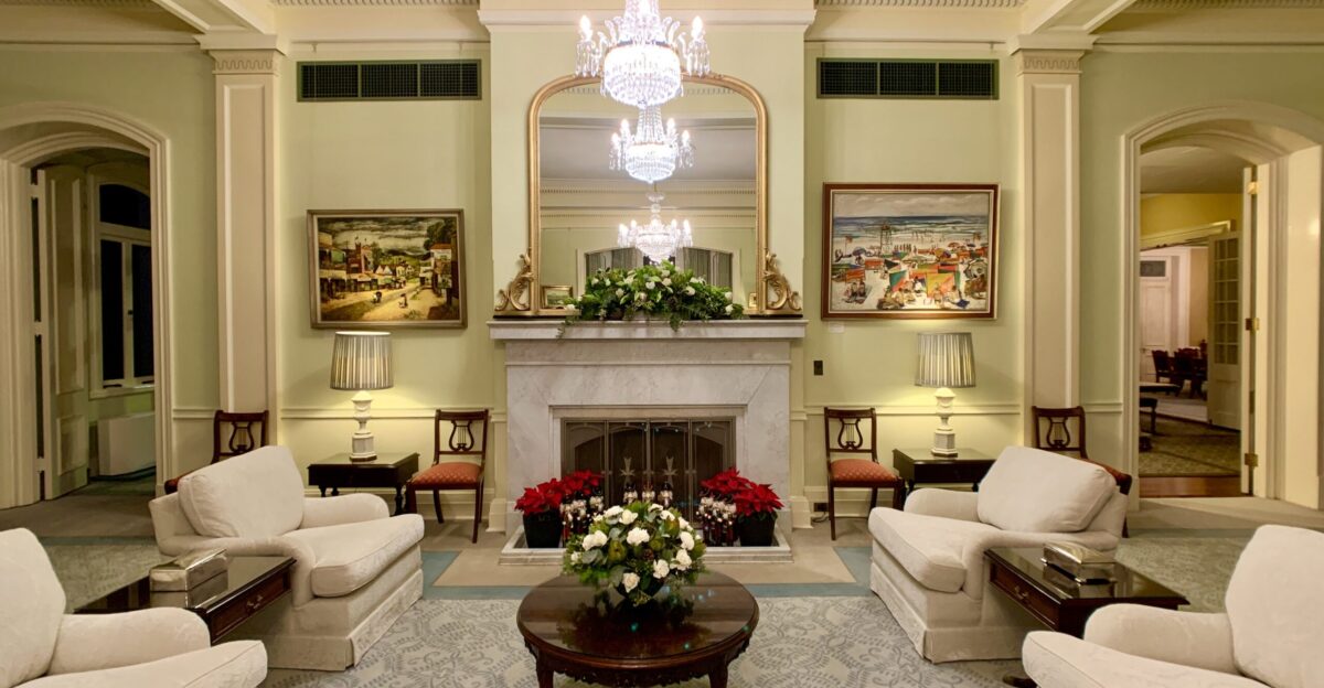
“Joy comes first, but curation amplifies joy,” says Kerrie Kelly of Kerrie Kelly Studio. When scale, palette, and light temperature work together, your favorite pieces read as intentional and cohesive rather than accidental. The problem isn’t the decorations themselves—it’s balance and restraint.
Professional designers spend years studying composition and visual hierarchy, principles that distinguish curated spaces from those that are cluttered. A home that whispers elegance invites guests in; chaos makes them anxious.
Here’s the Thing About “Tacky”
Designer Bethany Adams of Bethany Adams Interiors puts it bluntly: “Except for overly rude or crude decor, there is nothing that is inherently tacky. It’s all about how—and how much—you use it.” Tackiness sneaks in when something is overdone or combined with too many competing elements.
This perspective shifts the conversation from judgment to strategy. Your beloved items aren’t the problem; rather, deployment determines the final impression. A single inflatable charming; an army overwhelming.
Mark Your Calendar: February 1

Designers agree on one hard deadline for outdoor holiday decorations: February 1. Get everything down by then, or as Katherine Aul Cervoni, founder of Staghorn NYC, warns, “you enter the tacky zone.” Stale, faded decorations lingering on porches and lawns signal neglect rather than festive spirit.
This deadline marks the transition from winter to spring, and weathered décor shifts from intentional to abandoned. Plan your takedown now.
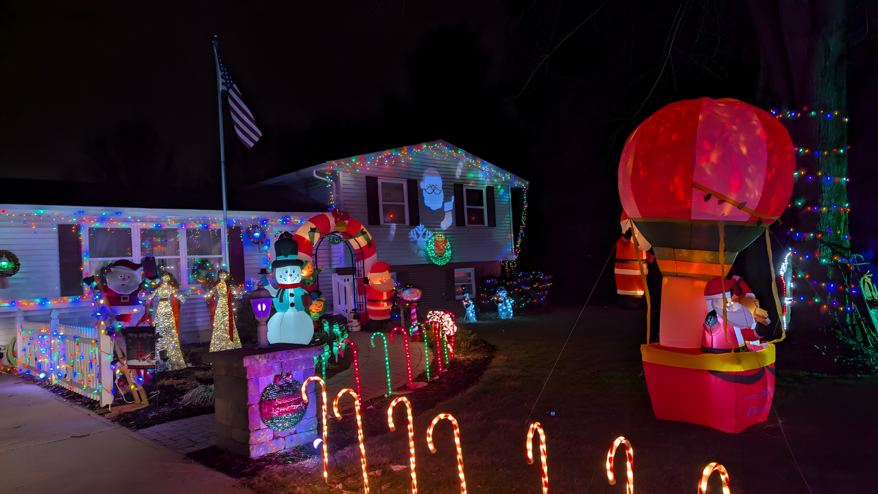
1 — Multi-Colored Blinking Lights
It’s not the colors themselves—it’s the motion. “This ends up looking cheap and overwhelming,” says Katherine Aul Cervoni. “Basically, it’s too Vegas.” Stick with warm whites. If you want color, go for it, but skip the blinking and running effects. The constant flashing creates visual chaos.
Psychologically, blinking lights trigger stress responses, while static, warm lighting promotes relaxation. This single switch elevates your entire aesthetic.
2 — Too Many Themes Mixed Together
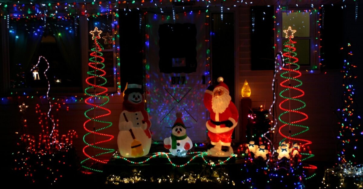
Commit to a single theme. Bethany Adams paraphrases Coco Chanel’s famous rule: “Always take one thing off before you head out the door.” Is it delicate icicle lights with urns of greenery, or jubilant inflatables with colored lights? Pick one narrative.
Mixing competing themes creates visual confusion and signals indecision. Consider your home’s architecture and existing palette. Every decoration should support your chosen story, creating a thoughtfully composed world.
3 — Net Lights Tossed Casually Over Shrubs
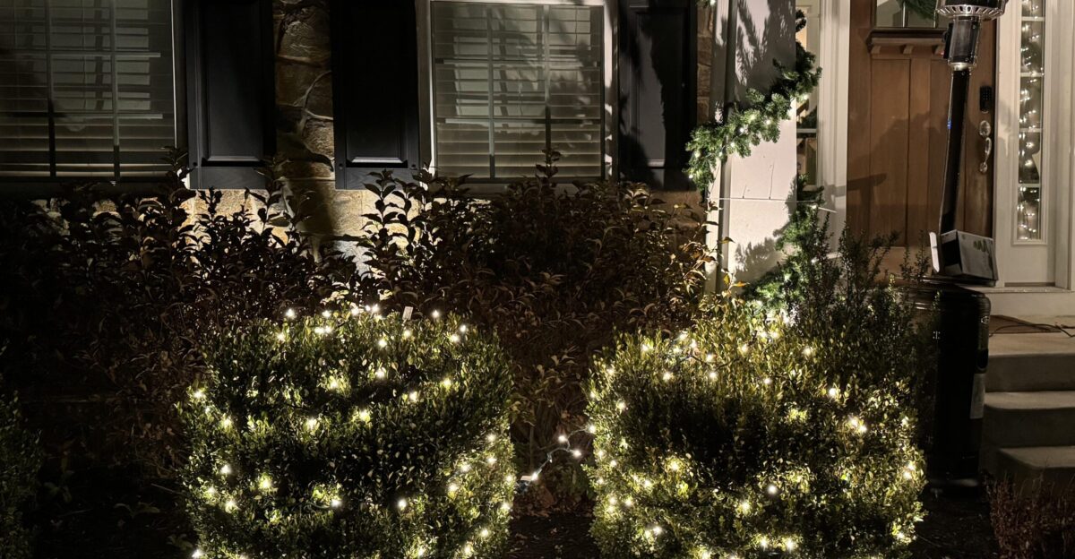
Katherine Aul Cervoni acknowledges: “I love convenience, especially with hanging Christmas lights.” But casually draping net lights over shrubs without shaping them properly looks like “a giant lit-up cheesecloth.” Shape them neatly to fit natural form.
This small time investment yields disproportionate returns. Professional landscapers sculpt net lights to follow the contours of shrubs, creating intentional silhouettes that enhance the natural beauty of the surrounding landscape. Fifteen minutes of effort transforms inexpensive lights into a polished, sophisticated look.
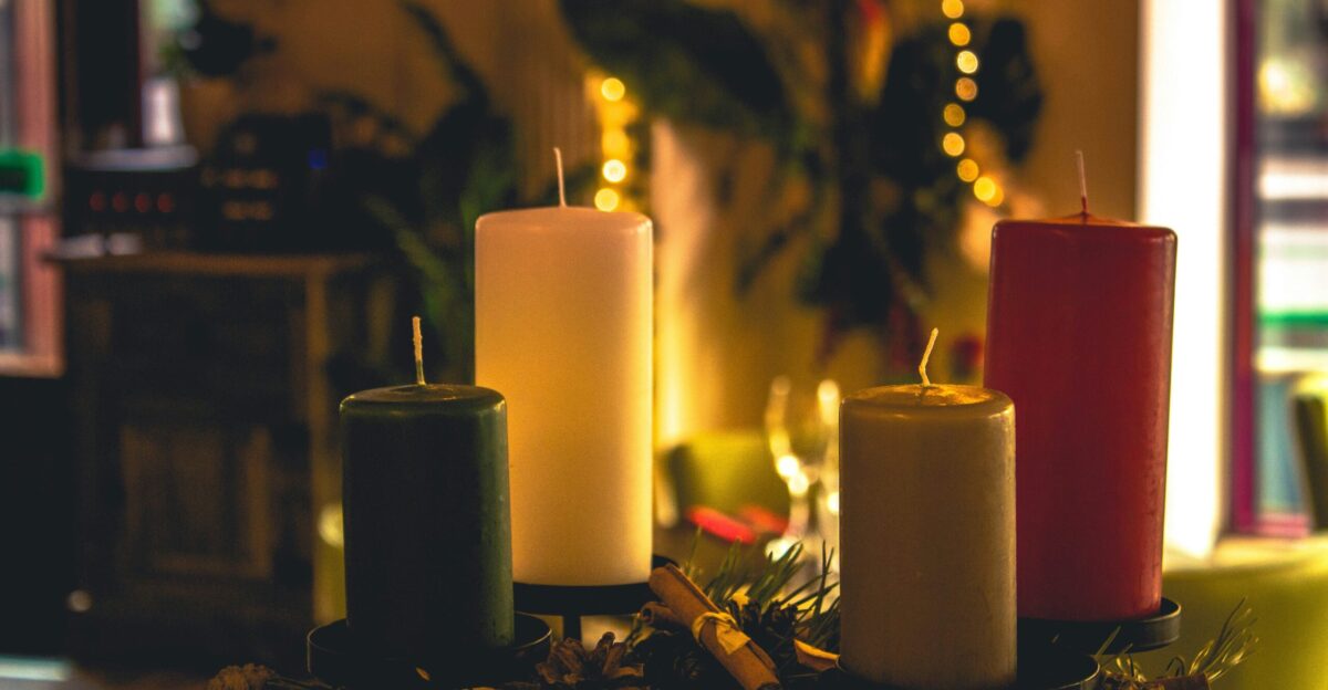
4 — Cluttered Mantel Villages
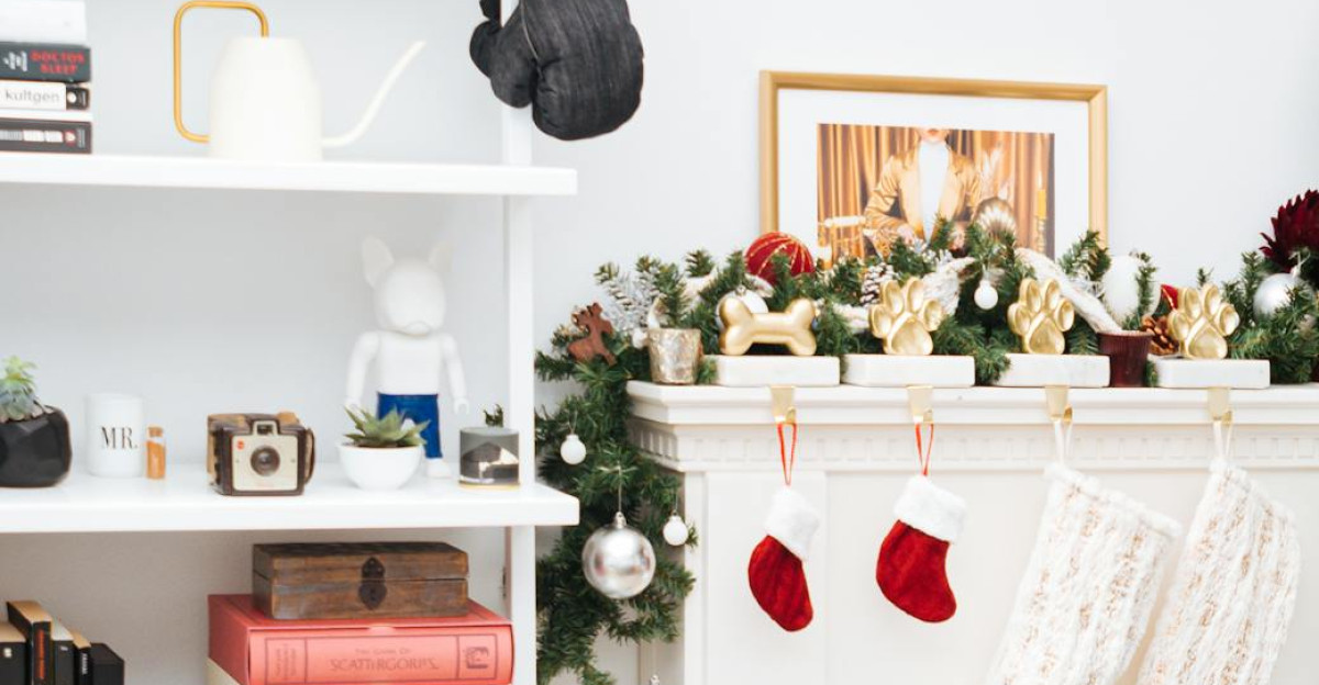
You don’t have to display every single décor item yearly. Kerrie Kelly warns: “Too many figurines turn elegant shelves into gift-shop displays.” Style in vignettes of three. Vary height with candlesticks or risers. Leave breathing room so the eye can rest.
The mantel is prime real estate where eyes naturally settle. A thoughtfully styled mantel tells a story through carefully selected pieces that complement each other in terms of texture and visual weight.
5 — Too Many Inflatables

Inflatables are fun, and kids love them. But use restraint. “One whimsical statement can feel charming; a whole brigade reads chaotic and obscures your architecture,” says Kelly. “Edit to a single hero piece and flank with real greens, lanterns, or uplights so the home—not the plastic—sets the scene.”
Your home’s architecture should remain the star. Decorations become the supporting cast, enhancing rather than overwhelming.
6 — Lights Glaring Into Neighbor’s Windows
Motion and strobe effects feel jarring and intrusive. Be a good neighbor. Opt for static washes or subtle snowfall effects specifically designed for your own house. Layer lanterns or pathway lights for warmth at eye level.
Bright lights piercing into someone else’s home create friction, not festive cheer. Aim downward, not across property lines. Neighborly holiday decorating means thinking about sight lines beyond your property.
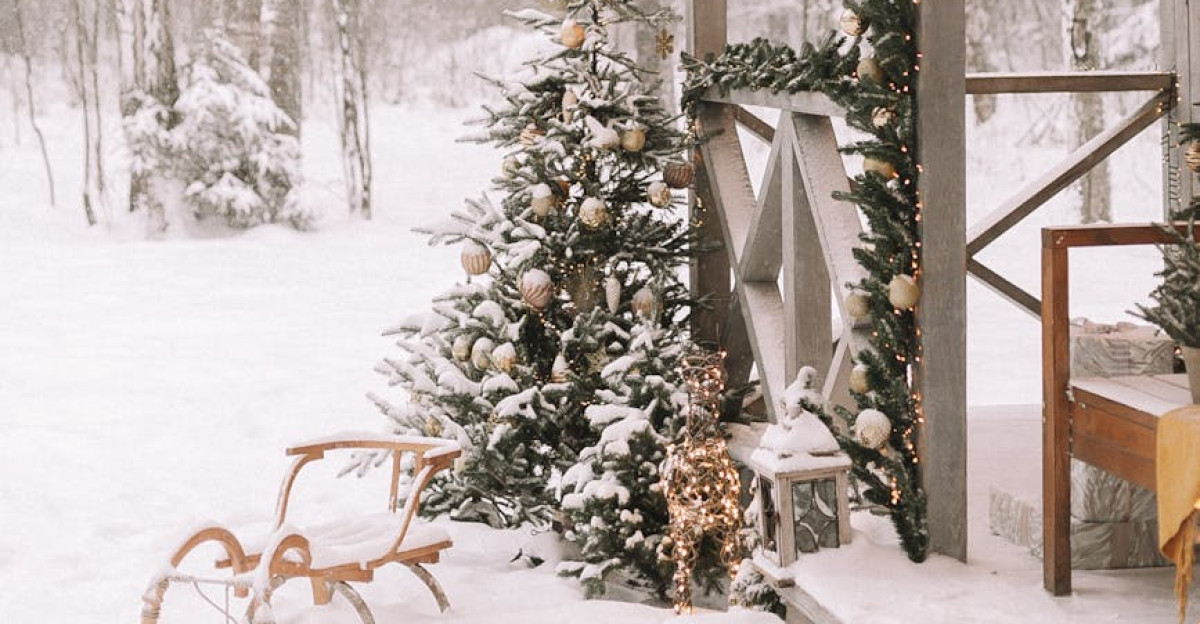
7 — Heavy Scents Throughout the House
The scents of the season are delightful, but moderation matters. “Overpowering fragrance feels artificial and can clash with holiday meals,” says Kerrie Kelly. “Keep scent natural and quiet—simmer citrus with cinnamon, add fresh greens, or light an unscented candle.”
Natural scents, such as fresh evergreen clippings and simmering citrus, create an authentic atmosphere without triggering sensory overload. Restraint in scent creates a sophisticated, inviting environment.
8 — Synthetic Ribbon That Won’t Hold a Natural Bow

The crisp plastic ribbon appears stiff and seems inexpensive. Kerrie Kelly recommends: “Swap for double-faced satin, velvet, or cotton twill; cut tails on a bias and use floral wire for generous, sculptural loops.” High-quality fabric drapes naturally and instantly elevates any wreath or garland.
Material quality signals care and intentionality. This upgrade—from three-dollar plastic to ten-dollar quality fabric—often receives more compliments than expensive ornaments.
9 — Outside Décor That Stays Up Past February 1

Travel, snowstorms, and life get in the way. But Katherine Aul Cervoni is clear: “Get it all down by February 1 at the latest, or you enter the tacky zone.” Weathered, faded decorations lingering into spring scream neglect.
Create a spreadsheet documenting every decoration, location, and storage spot. Take photos before decorating. When early February arrives, treat takedown as a systematic project, not a scramble.
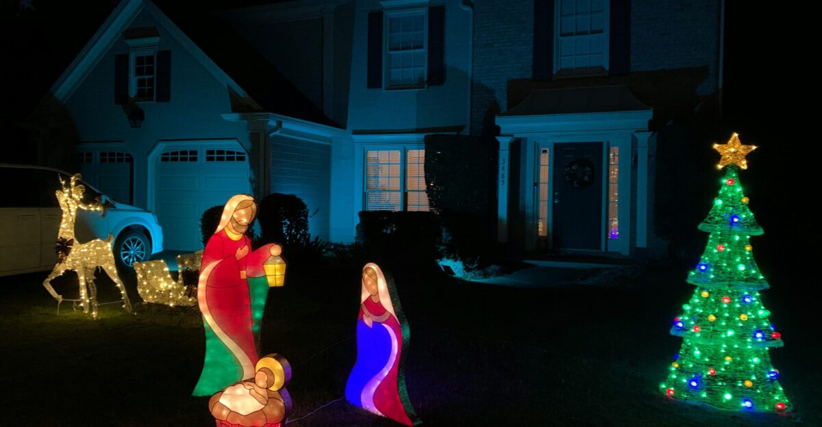
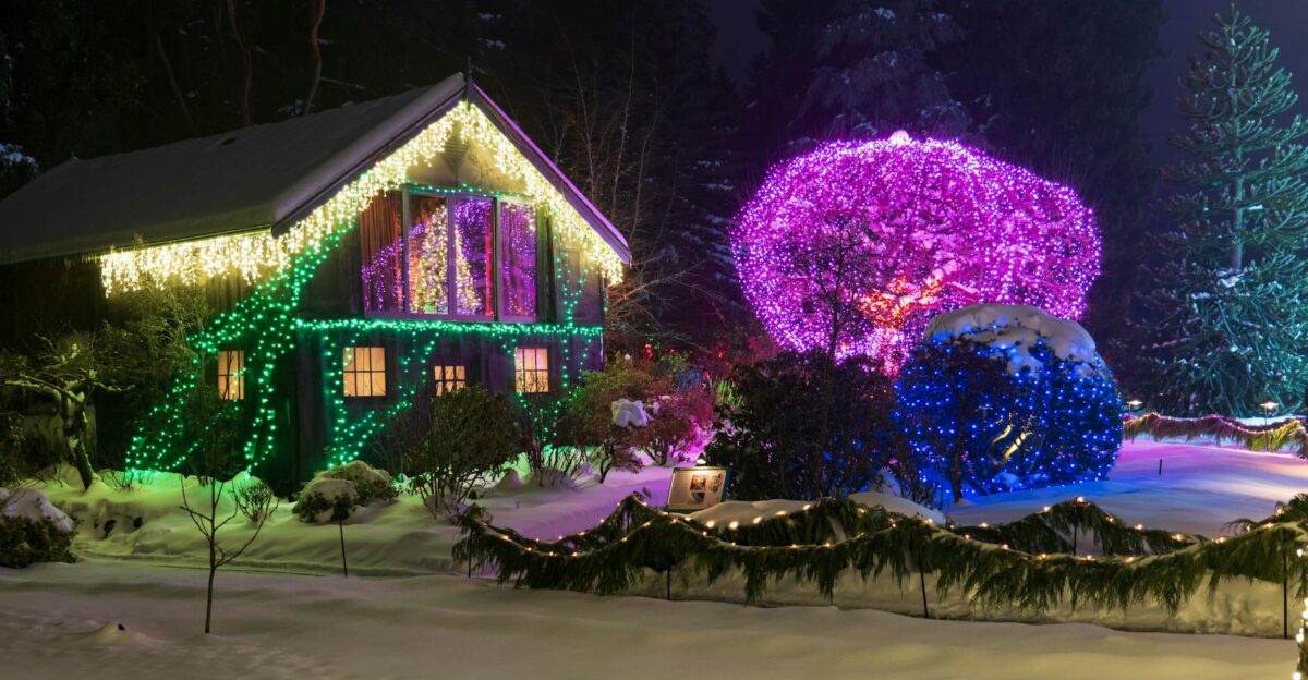
The Warm White Lighting Standard
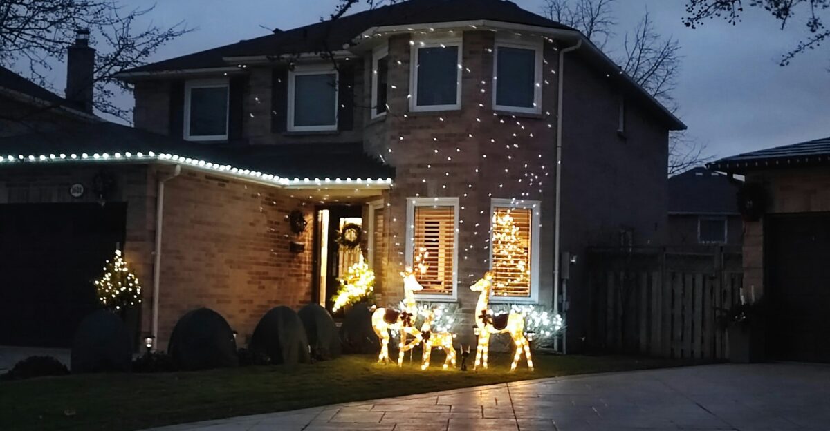
Designers unanimously recommend warm white lights with a color temperature between 2700 K and 3000 K. This spectrum closely mimics the traditional incandescent bulb, creating a softer, more welcoming ambiance. It unifies displays and makes simple setups appear expensive and thoughtful.
The difference between warm white and cool white is immediately perceptible and has a dramatic impact on the overall aesthetic. Warm white evokes a sense of tradition, intimacy, and warmth. Cool white reads clinical and cold. Invest in quality warm white LEDs.
Curation Is the Real Luxury
Kerrie Kelly sums it up perfectly: “When scale, palette, and light temperature work together, your favorite pieces read as intentional and cohesive rather than accidental, letting your home feel warm, welcoming, and beautifully composed.” This separates a curated holiday home from a cluttered one. Every piece has purpose and intention.
Luxury isn’t measured in quantity or expense; it’s expressed through restraint and thoughtfulness. The most impressive homes feature fewer decorations, deployed with precision.
The Edit-First Philosophy
Before hanging anything, ask: Does this serve the overall vision? The most expensive-looking homes aren’t those with the most decorations—they’re the ones that know what to leave out. If you’re adding three new pieces, remove one existing piece. If everything stays, the space becomes visually exhausting.
Subtraction is the secret to sophistication. This constraint trains your eye and cultivates intentionality, actually enhancing rather than limiting creativity.
About Those Childhood Memories
Bethany Adams confesses: “Those colorful lights were on my tree as a child, so I feel an emotional connection to them, and I’ve always put them up with pleasure on my indoor tree.” Nostalgia matters. You can keep what you love—just contain it.
Dedicate a specific area, like the family tree or one room only. This approach honors sentiment without compromising overall aesthetic vision. Both heart and eye are satisfied.
Planning Your Takedown Now
Set a specific date in early February to remove all exterior holiday décor. Assign helpers. Create a checklist of every item, location, and storage spot. Take photos before decorating so you remember what goes where. A well-organized takedown prevents items from lingering into tacky territory.
Preparation now means seamless execution later. This systematic approach transforms a daunting task into a manageable, organized project.
Joy First, Curation Always

Your holiday decorations should bring genuine delight to your home and neighborhood. By avoiding these nine common mistakes and embracing restraint, you create a space that feels intentional, warm, and beautifully composed. That’s not limiting joy—that’s amplifying it.
Designers prove that less really is more. The most memorable holiday homes succeed through thoughtfulness and restraint, not through sheer quantity or effort.